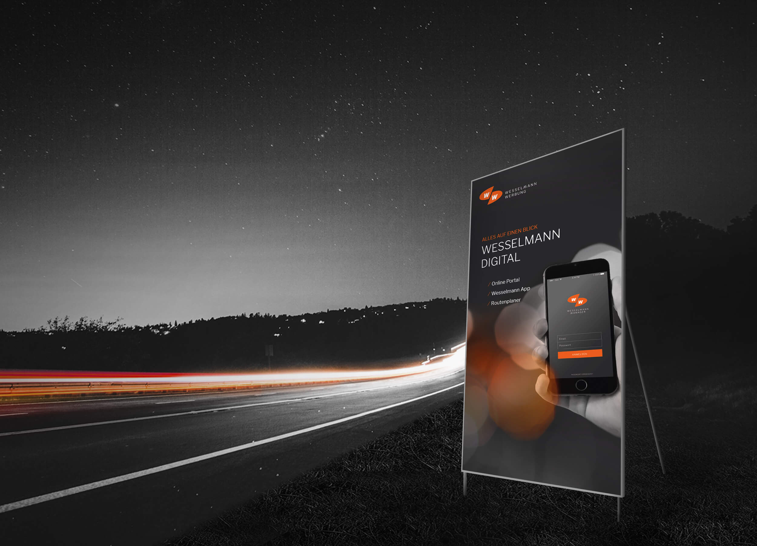
Clear, independent and concise – the new corporate design of Wesselmann Werbung
Clear, independent and concise – the new corporate design of Wesselmann Werbung
Initial situation
How do you carefully develop a visual language and transfer it to the here and now?
Bringing existing stakeholders along and gaining new ones – this was the central task for the brand sharpening of Wesselmann Werbung. Established brand parameters had to be adjusted and new ones implemented at the same time. All this in harmony with the new brand positioning.
Consolidate and strategically expand market leadership
After an extensive analysis phase of the company, it quickly crystallised that only an evolutionary approach could be purposeful in the conception of the new corporate design guidelines. The task was to carefully optimise the visual brand core and at the same time introduce new design tools to meet the challenges of the future. The brand relaunch had to take this into account.

Show your colours
The colour orange will be a central component of the new visual language. In future, it will be found in typography, illustrations, iconography and the visual language. Accentuated or extremely bold, it always quotes the logo as the brand core of the company. This is flanked by the use of a wide variety of black values and the consideration of a lot of white space.
Striking and airy – the new brand design in use
The stringent use of the newly defined visual brand parameters will create a consistent brand perception across all communication channels in the future. With one clear goal: to strengthen Wesselmann Advertising and prepare it today for tomorrow.
