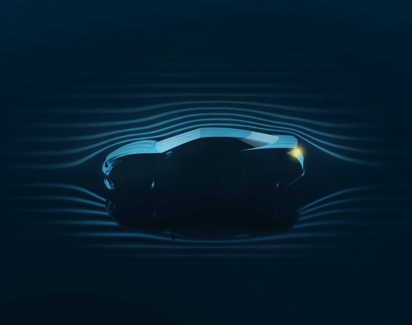
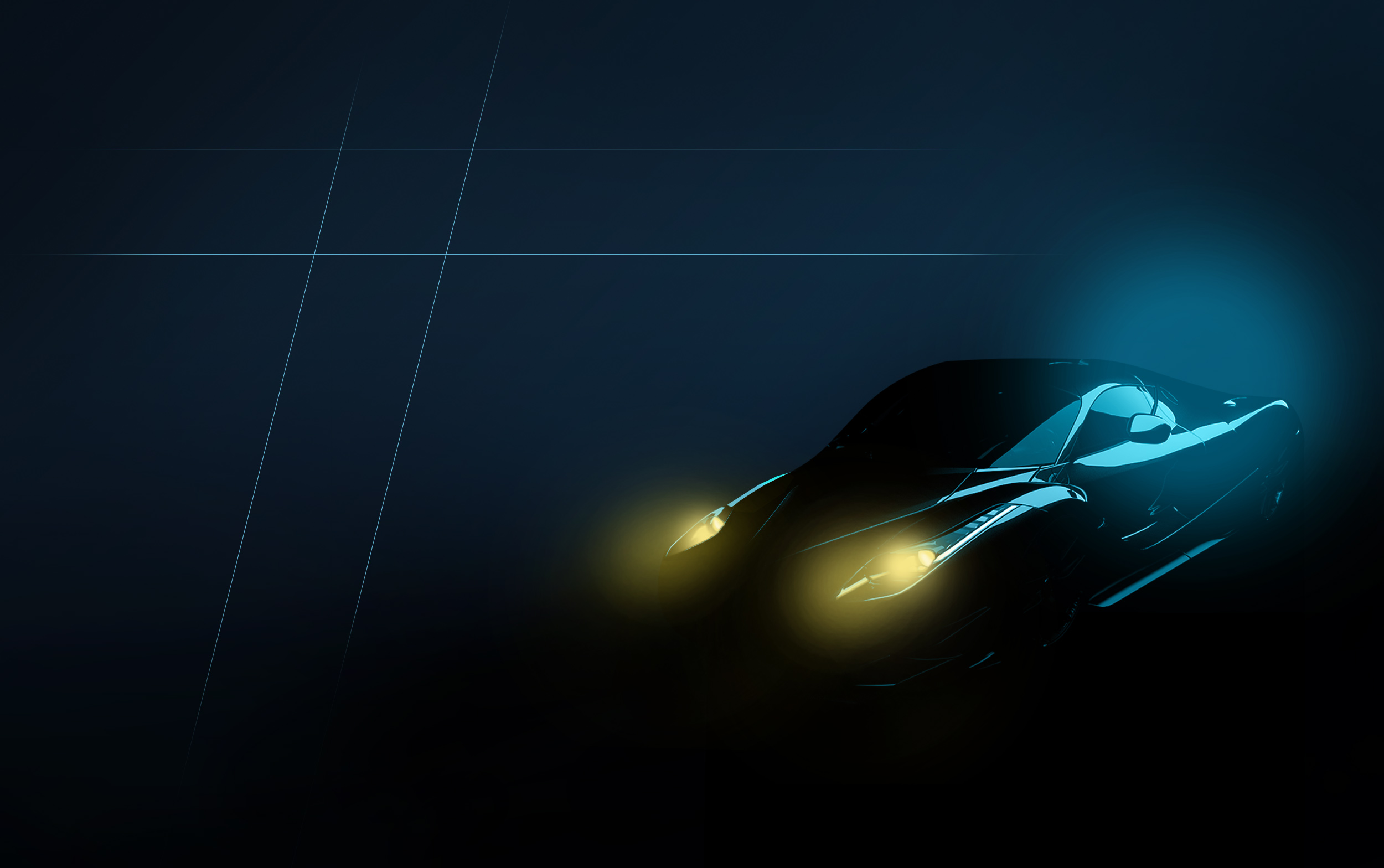
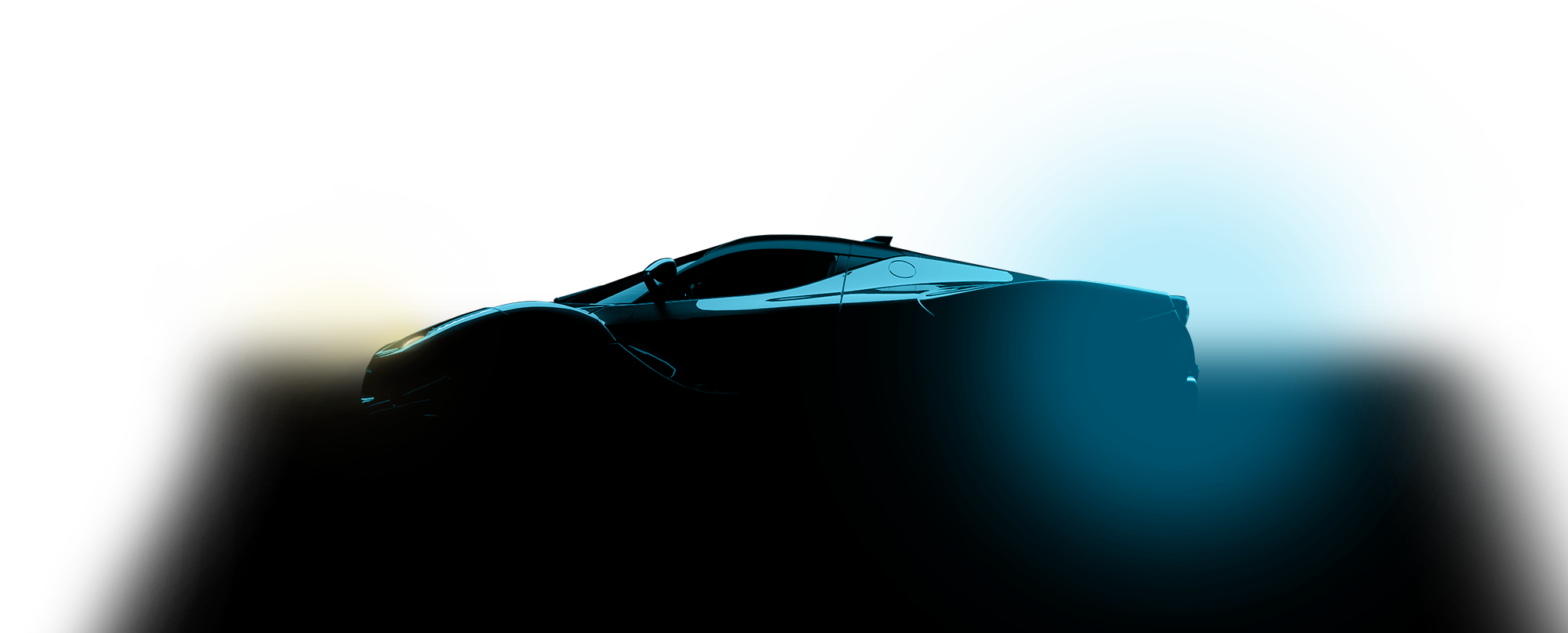
The development of the basic visual parameters was to meet the company’s technological demands. For this purpose, a colour world was developed that works with a primary blue palette. Yellow as an accent colour breaks the monotony and creates tension. The colour spectrum is flanked by secondary colours, which are primarily used in the web app. An independent icon set was developed for the extensive range of services.
The house font Oxanium impresses with its good legibility in small sizes and unfolds its futuristic characteristics in large texts. The imagery also reflects the company’s technological and future-oriented aspirations. All in all, all the individual design elements create a highly independent and modern appearance that clearly stands out from the competition.

The visual language is futuristic, clearly structured, uniform in colour and flanked by the accentuated colour yellow


Alexander Willuweit
Managing Director / Creative Director,
CRENEO
