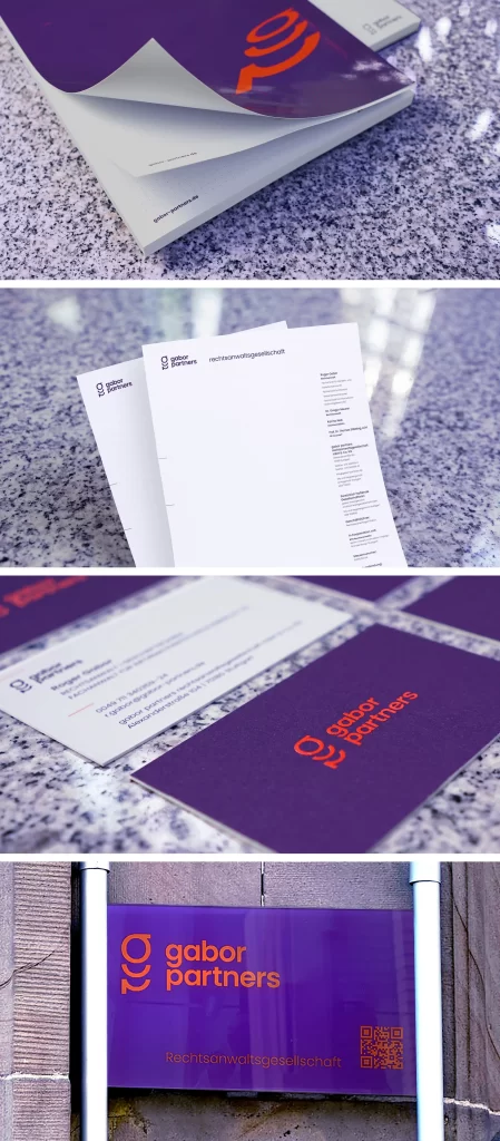
The new corporate design of gabor partners rechtsanwaltsgesellschaft is intended to position the company as an independent, concise and modern law firm and to create a clear distinction from its competitors. To this end, the first step was to identify and analyse the direct competitors.
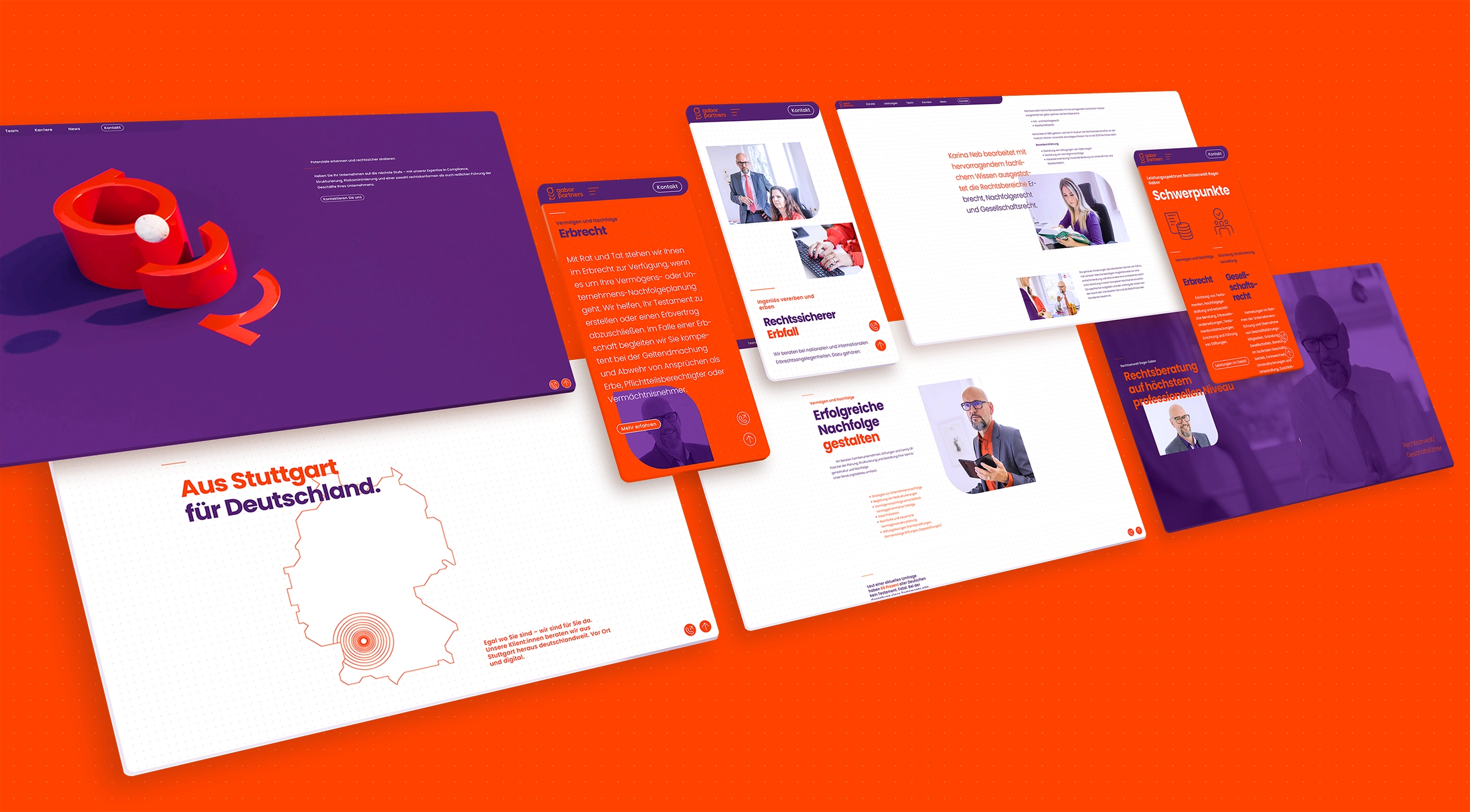
This led to the idea of creating a striking brand image using a colour set that is untypical for the segment. A strong signal design system ensures a high level of recognition across all channels. Micro-animations, a striking use of colour and a homogenous image world ensure an independent and lively corporate image that is rightly not overlooked.
The logo consists of a figurative and a word mark. The figurative mark is a simplified representation of the letters “g” and “p”. At the same time, the figurative mark also functions as a vehicle to communicate a wide variety of service dimensions of the firm.
The choice of a thin typeface creates an interesting interplay between colour, white space and the power of typography.
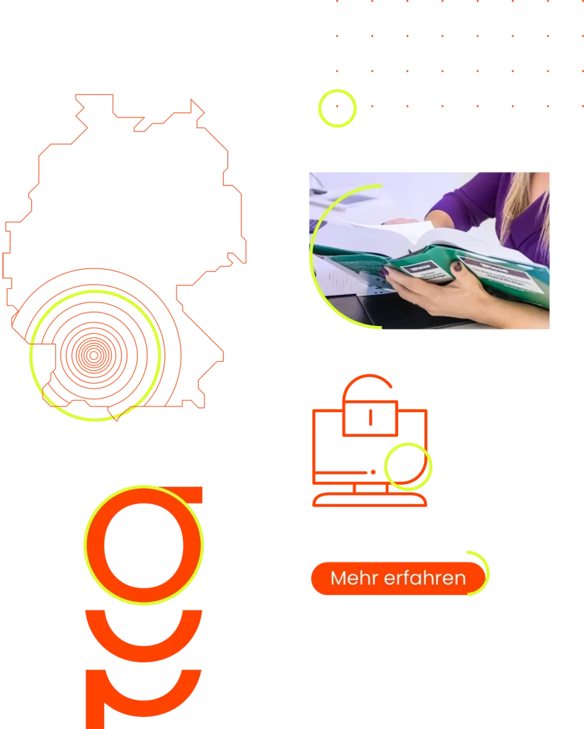
The shape of further design parameters is derived from the figurative mark. It is found again in grids, icons, surfaces and image forms. The design language is used in an accentuated way.

The animated 3D logo conveys a wide variety of messages from the 3 specialist areas. It increases the attention of the interest groups within the website and provides additional visual variety.
The animated 3D logo conveys a wide variety of messages from the 3 specialist areas. It increases the attention of the interest groups within the website and provides additional visual variety.
The visual world consistently follows the newly developed colour code of the law firm. Plenty of space, a clear focus on the protagonists and a discreet colouring of the light areas ensure a coherent image concept.

The central approach of the concept is fact-based storytelling. Current statistics on inheritance and wills underline the relevance of the topic for the exclusive target groups.
As a further stylistic device, moving images with impressions from the law firm are established in the new corporate design of gabor partners. This creates more proximity for prospective clients and at the same time brings the website to life. A conscious decision was made to use monochrome colours so as not to distract from important messages despite the movement.
The central approach of the concept is fact-based storytelling. Current statistics on inheritance and wills underline the relevance of the topic for the exclusive target groups.


The new corporate design of gabor partners rechtsanwaltsgesellschaft is characterised in its digital presence by a strong boldness and a balanced density of information. Colour changes within the viewports, varying font styles/sizes as well as micro animations create a pleasant, fresh and accessible web presence. The balanced use of images and videos was done with consideration of the website performance.