More than design – a project of the heart
More than design – a project of the heart.
Initial situation
Competent palliative care for children and young people with life-shortening illnesses can only succeed in a multi-professional setting.
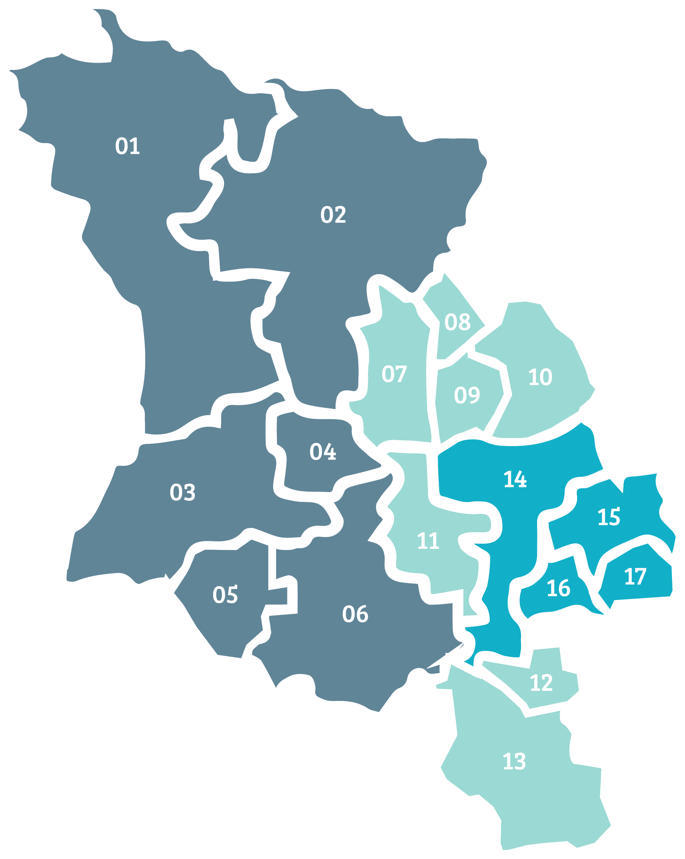
For this purpose, the North Rhine Children’s Palliative Network was founded under the leadership of Dr Gisela Janßen. The network covers the regions of Lower Rhine, Rhine-Ruhr and Bergisches Land. By networking the various providers and bundling offers and information overviews of regional care options, individual care for families can be further opti-mised locally.
As part of a pro bono project, CRENEO developed and implemented a new corporate identity for the North Rhine Chil-dren’s Palliative Network. The logo, colour scheme, imagery, iconography and typography now follow a uniform and contemporary visual language.
Word and figurative mark
After a thorough analysis of the segment, a new word/figurative mark was created that is available in two versions. There is a full version and a shortened version. The figurative mark also serves as a visual platform for the newly developed iconography concept. This is used, among other things, in the new website.
Colour world
The colour world works with delicate pastel shades. The shade of turquoise creates contrast and also functions as a transport layer for the headlines in the online offer.
Iconography
The figurative mark functions as a transport level for the specific icons. The pictograms coming from the bleed create tension and generate an individual symbolic language.
Illustration style
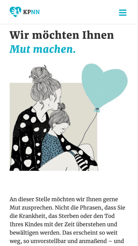
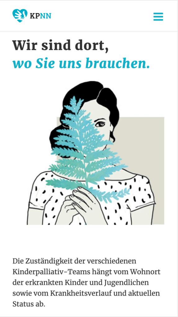
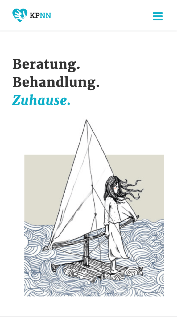
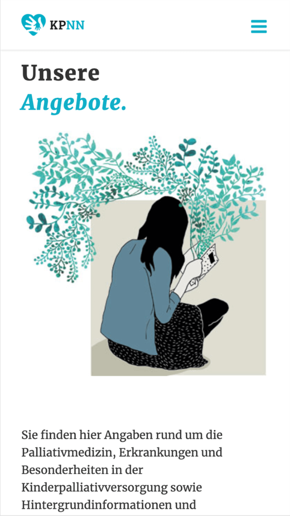
A ship appears at irregu-lar intervals in the multitude of illustrations. This functions as a stylistic device for the transition between life and death. At the same time, the illustrations build a bridge to the palliative team logos developed by sick children. The simplified and characterful stroke of the illustrations achieves a high degree of visual independence.
Concept and realisation of the website
The website is kept minimalist and has a lot of white space. Minimal animations support the reception of information at relevant points or act as focal points. The content is distributed unevenly on the visible surfaces and thus breaks the monotony of a rigid grid. In addition to the desktop view, additional layout variants were developed and designed for other devices.
„
Thanks to the commitment and expertise of the CRENEO team, we have received a modern and well thought-out new image. This was positively received by affected families, staff and carers after only a short time. The structured ap-pearance makes it possible to receive information quickly and clearly. This means that the individual interest groups can now be helped even better.
Dr. Gisela Janßen,
overall management,
Children’s Palliative Network North Rhine
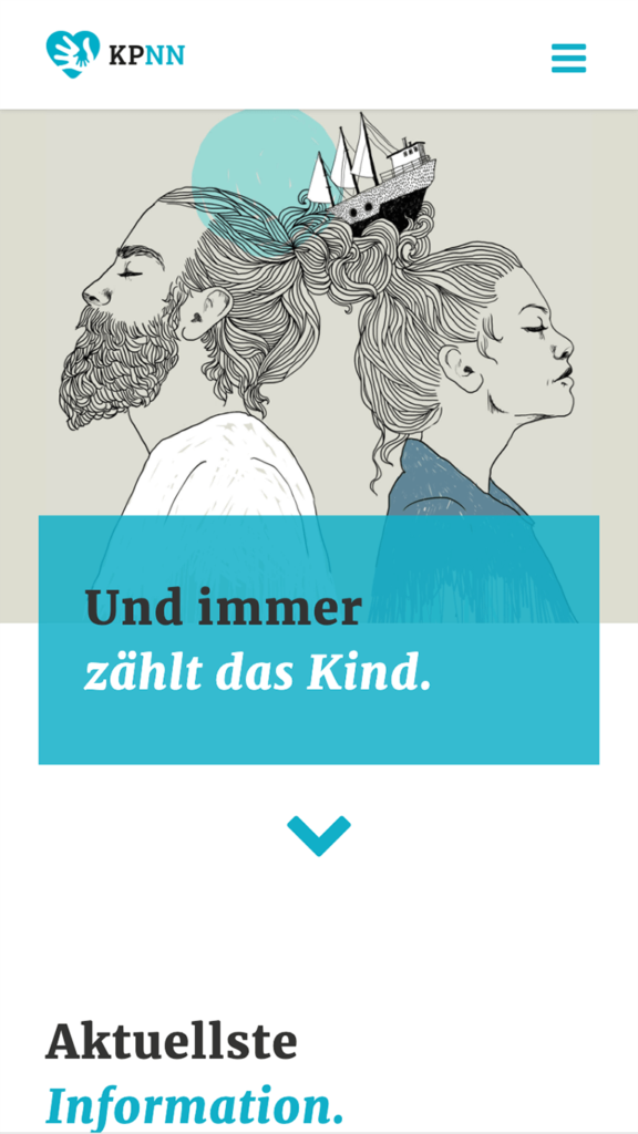

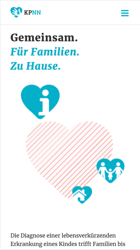
The current website serves as a basis and will be supplemented with additional content in the future. Among other things, an additional section with the target group focus “doctors / professional institutions” is being planned.
Special thanks to Helke Rah for her support in general and her outstanding illustrations in particular.
