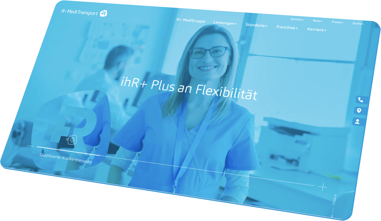
CRENEO was commissioned to sharpen the brand. The brand architecture developed by CRENEO was formally adapted. In addition, the brand design was enhanced with illustrations, icons and a new image mechanism to harmonise and strengthen the brand perception. After optimising the brand design parameters, a new corporate website was developed and realised.
The core element of the brand architecture is the R+ logo. It acts as an anchor for all sub-brands.
The basis of the newly developed iconography family is the design of the figurative mark. It serves as a formal transport level for the multitude of symbols.
The R+ logo is an essential component of the future image world.


The newly developed illustration world conveys the modern and future-oriented claim of the company. In the new corporate website, these are brought to life through micro-animation.
The new corporate website is clearly structured with a lot of white space and will serve as a platform for new business areas in the future, such as an innovative franchise concept in the field of qualified patient transport.
