A lot of white space organises and facilitates the absorption of information. Well-dosed animated sequences promote storytelling. The result: an adequate corporate website for all stakeholders.
The new corporate website presents the group of companies as well as all subsidiaries and shows the respective key services. Furthermore, the product and service portfolio is explained in detail and flanked by scrolling. Animations, films and an appealing graphic language, coupled with useful internal links, increase the informative duration of the visit.
The animation of users to make contact is done through well-dosed CTA elements distributed throughout the website. The viewing of reports, such as the annual environmental statement, is facilitated by a Flow-Paper tool.
The result: a new digital corporate presence with measurable success.
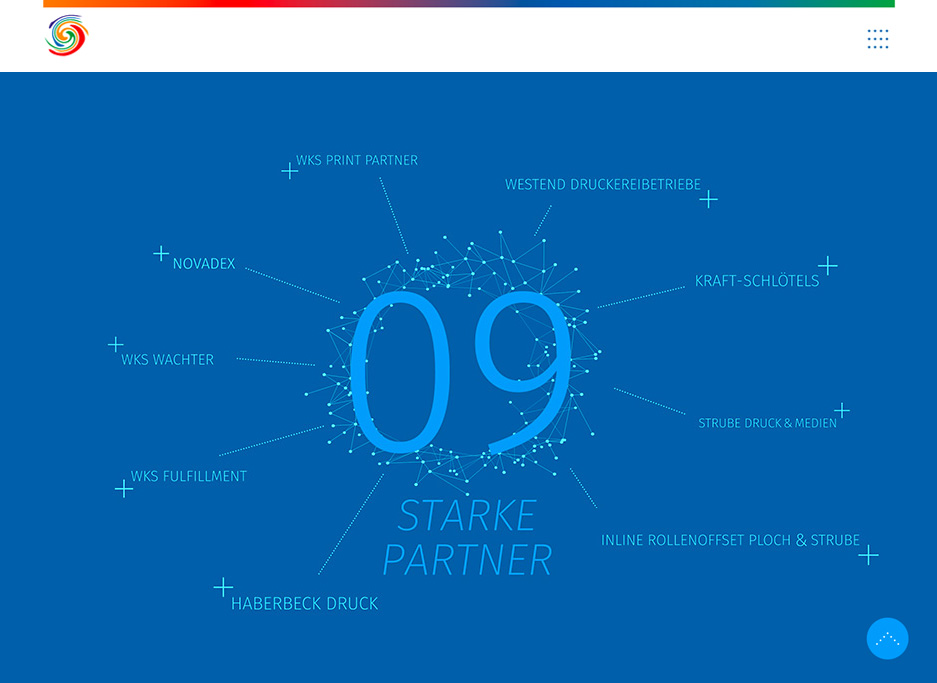
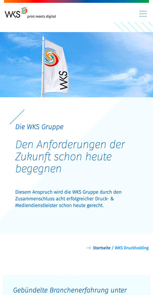
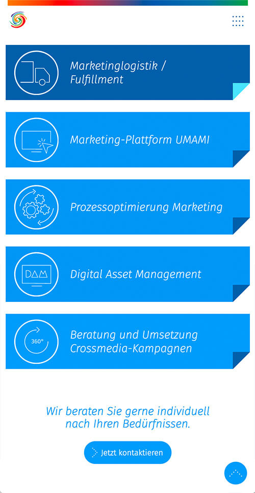
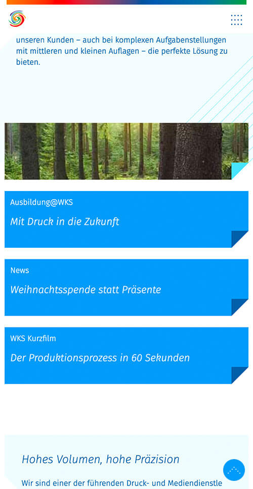


From the beginning of the first considerations for the new corporate website, we consistently thought in terms of opti-mal mobile use and performance.

Christian Schade
Managing Director Sales,
WKS Group
Christian Schade
Managing Director Sales,
WKS Group
