Order. Structure. Stringency.
An orderly structure through clear colour clusters within the AWO Mittelrhein departments was a central component of the careful brand design adaptation. This was accompanied by the development of individual illustration styles. The central aspect of the relaunch, however, was the first stringent use of the newly defined design parameters within all media and communication channels.
Orientation through orderly use of colour.
Colours create emotions. However, colours are also a predestined vehicle for creating structure and order within con-sumer graphics. In the digital context, this is a crucial tool for promoting user experience.
In the implementation of the new analogue and digital AWO Mittelrhein communication media, the colour world was consistently used in the orchestrated visual language within the individual design tools. The result is a high degree of orientation and recognition.
The AWO moves people. We move the AWO.
Pictures speak louder than words – moving pictures speak volumes. One of our basic ideas for the future implementa-tion of digital communication was to flank the communication messages with moving images. Because movement increases user interest and creates relevance. In order to adequately convey the communication messages, an illustration and iconography concept is needed for this.

No shining without shining through: The AWO workshop.
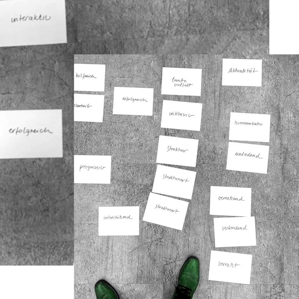
Before the first thoughts about the new orientation of AWO Mittelrhein were made, facts had to be established. What are the AWO values? Where are the pain points? What direction does AWO Mittelrhein want to take in the future? Questions upon questions – predestined for the CRENEO organisational workshop. The results formed the basis for the substantive and formal reorientation of the AWO Mittelrhein district association.